The Posters
This is a project called ‘Formes Typographiques’ that I completed while studying in Geneva. Our brief was to design an alphabet, make stamps from it (with the material of the stamps influencing the letterforms) and then to design and print at least five 100cm x 70cm posters showcasing the type. I named the typeface Moitié-Moitié. It’s a famous Swiss delicacy and also means ‘half and half’ which is the way the type was designed; in two halves.


The Concept
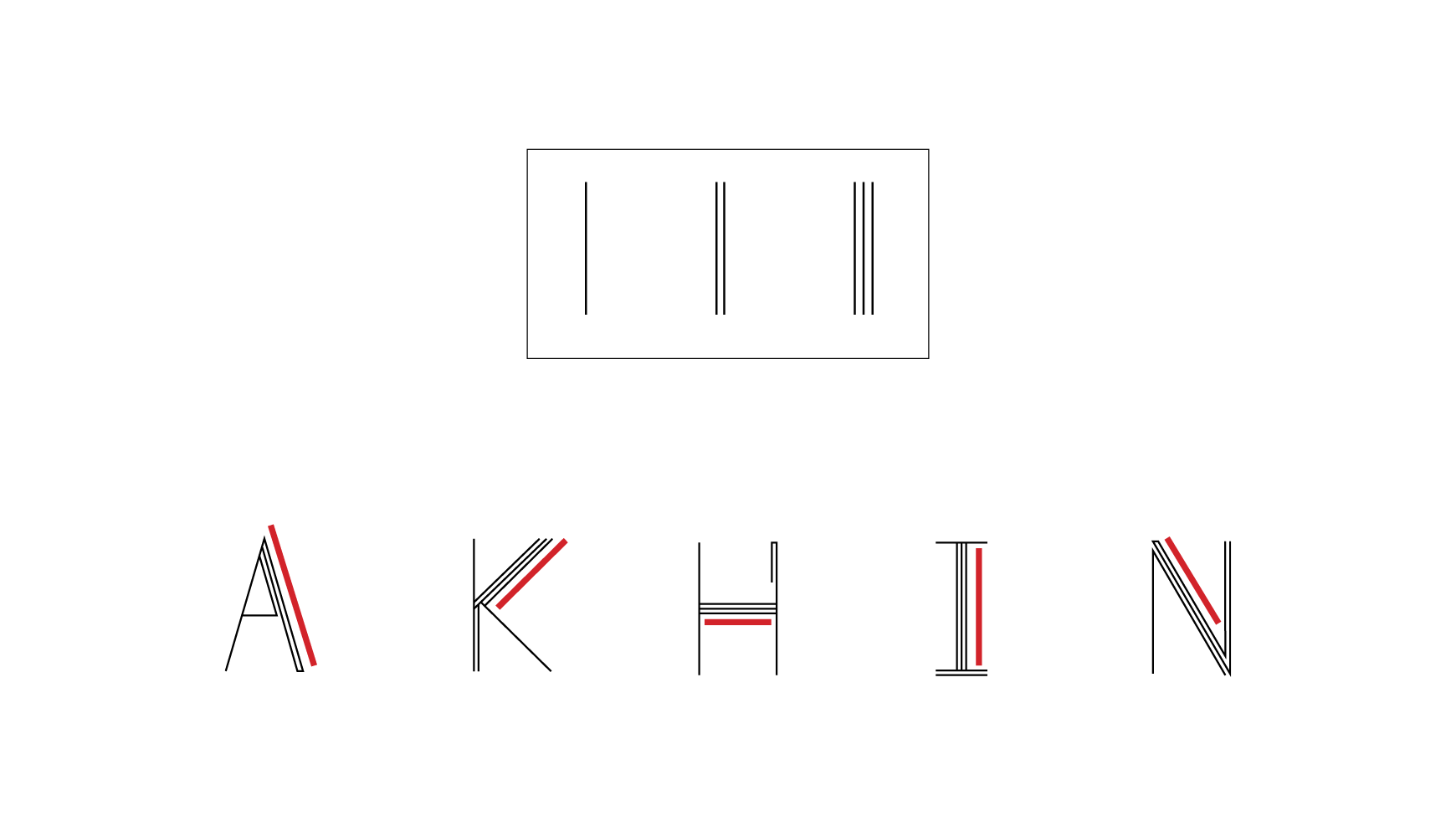
To begin designing my typeface I looked at the legibility of the upper half and lower half of letters in both lower-case and upper-case. In lower-case the upper half of each letter was more important and offered more legibility when isolated. With upper case letters however it wasn’t so consistent. I used this observation to inspire my typeface. I put emphasis on the more important half of the letter and I looked at which strokes are most important and unique to each individual letter. I came up with a system of using one, two and three-stroke lines. I used the thicker three-stroke lines to emphasize the most important parts of each letter.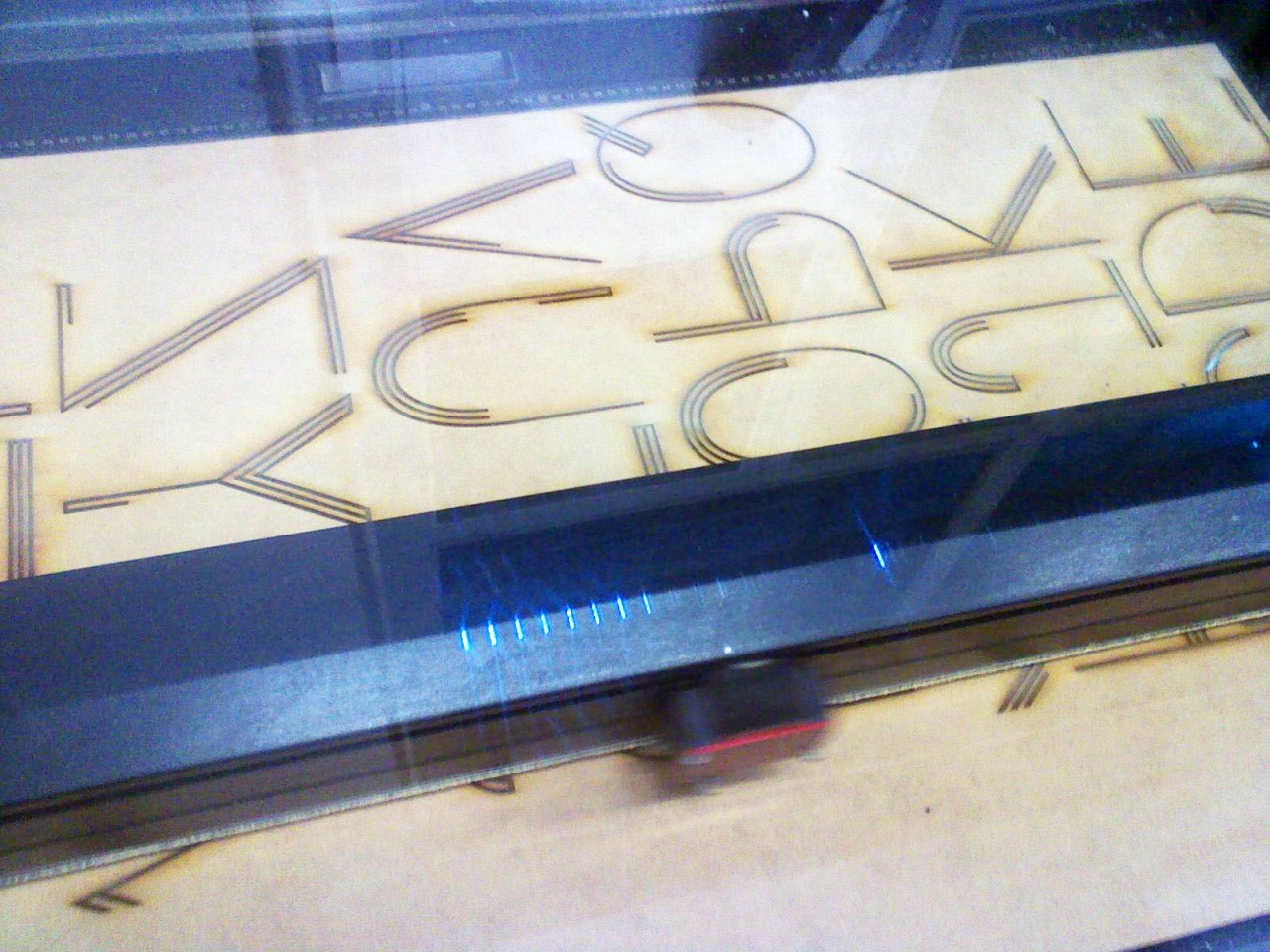
Process
Here you see a machine laser engraving the letterforms into fretwood. Next the wooden board was cut into individual letters. Then I glued lengths of string into the grooves to create a relief surface in order to use the letters as stamps. To print, I simply used poster paint to coat the strings on the stamps.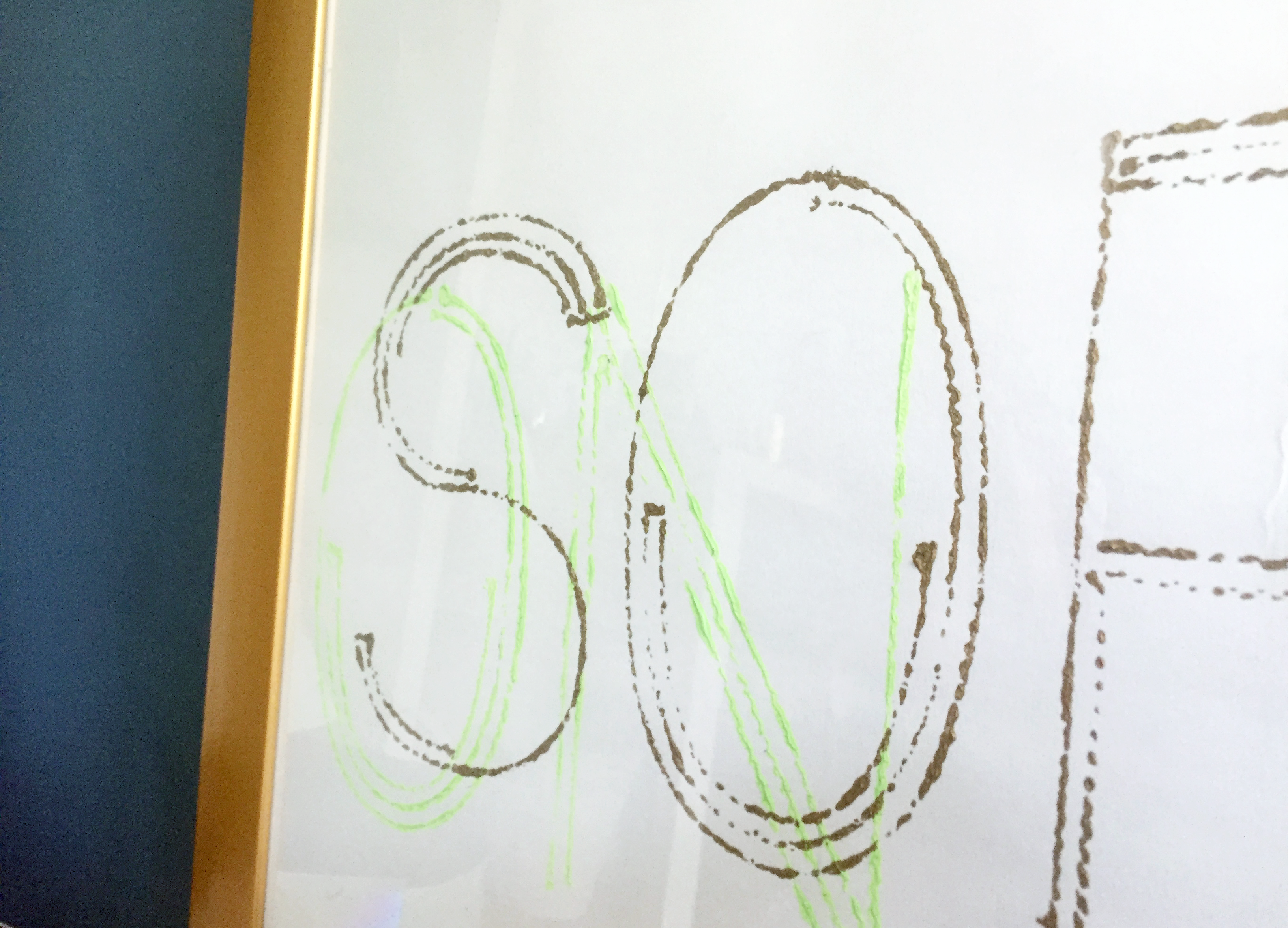
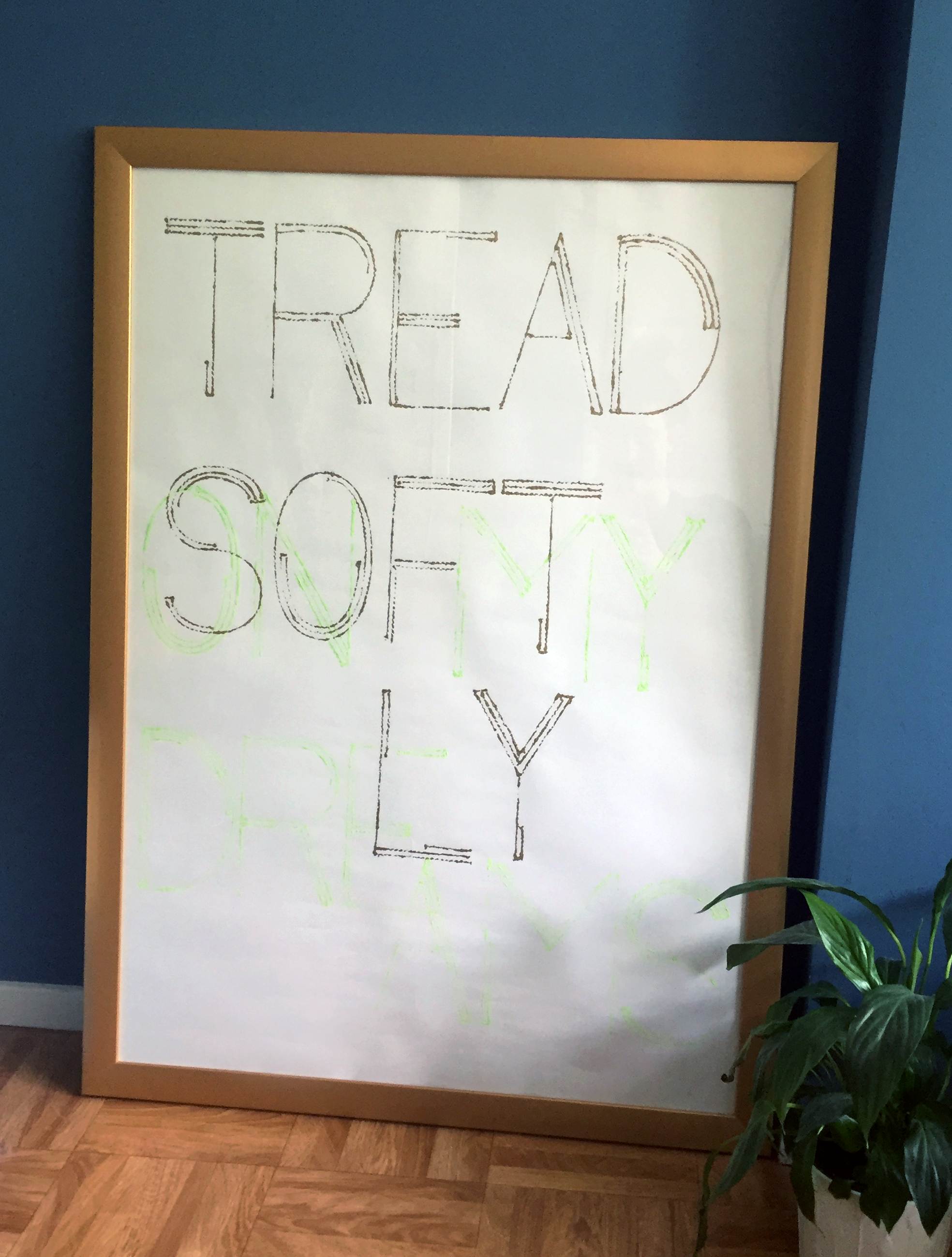
Some years after I designed and made the typographical stamps, I decided to print a new poster for myself inspired by the quote ‘Tread softly because you tread on my dreams’ from Irish poet W.B. Yeats. I liked the idea of the poster having two layers. At first glance, you see only the request to ‘tread softly’, but on closer inspection, ‘on my dreams’ reveals itself. The reason behind the request. The colours are those od the Irish flag, which are often described as ‘green, white and gold’.